The mobile designer allows you to set up a dashboard for better viewing on your mobile device.
Using the mobile designer
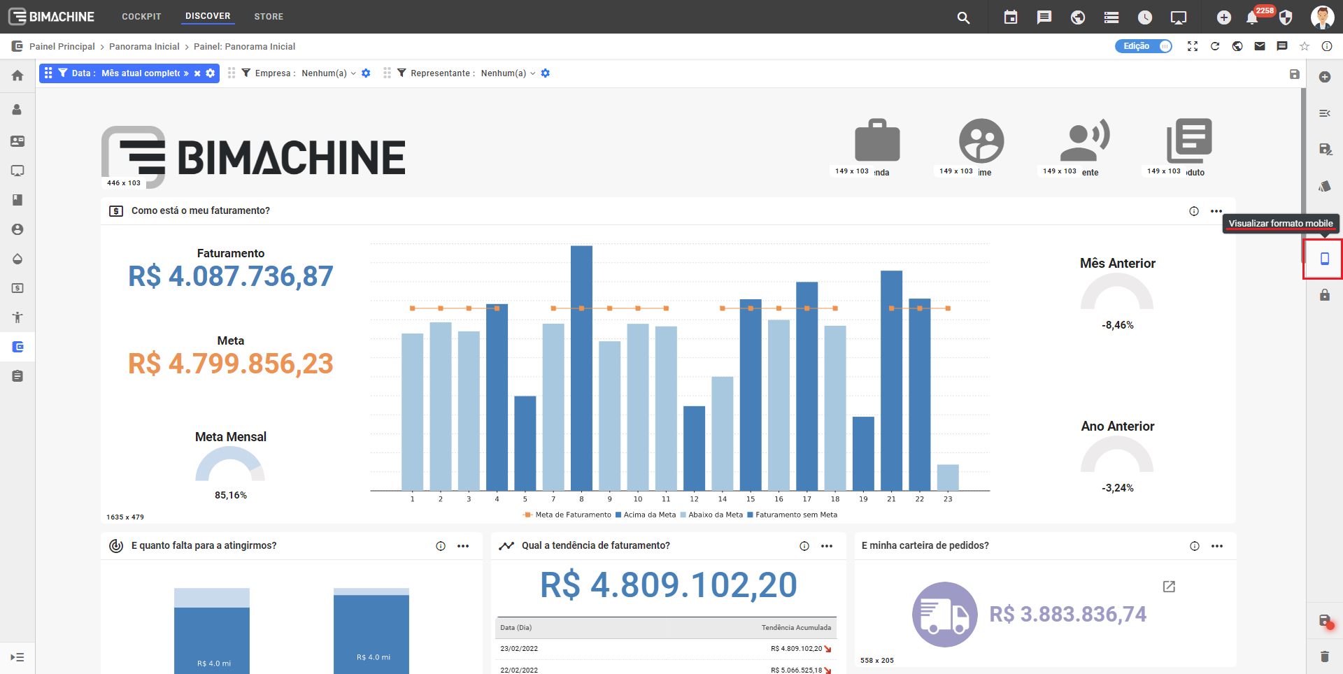
In Discover mode with the Edit flag enabled, locate the "View mobile format" icon.
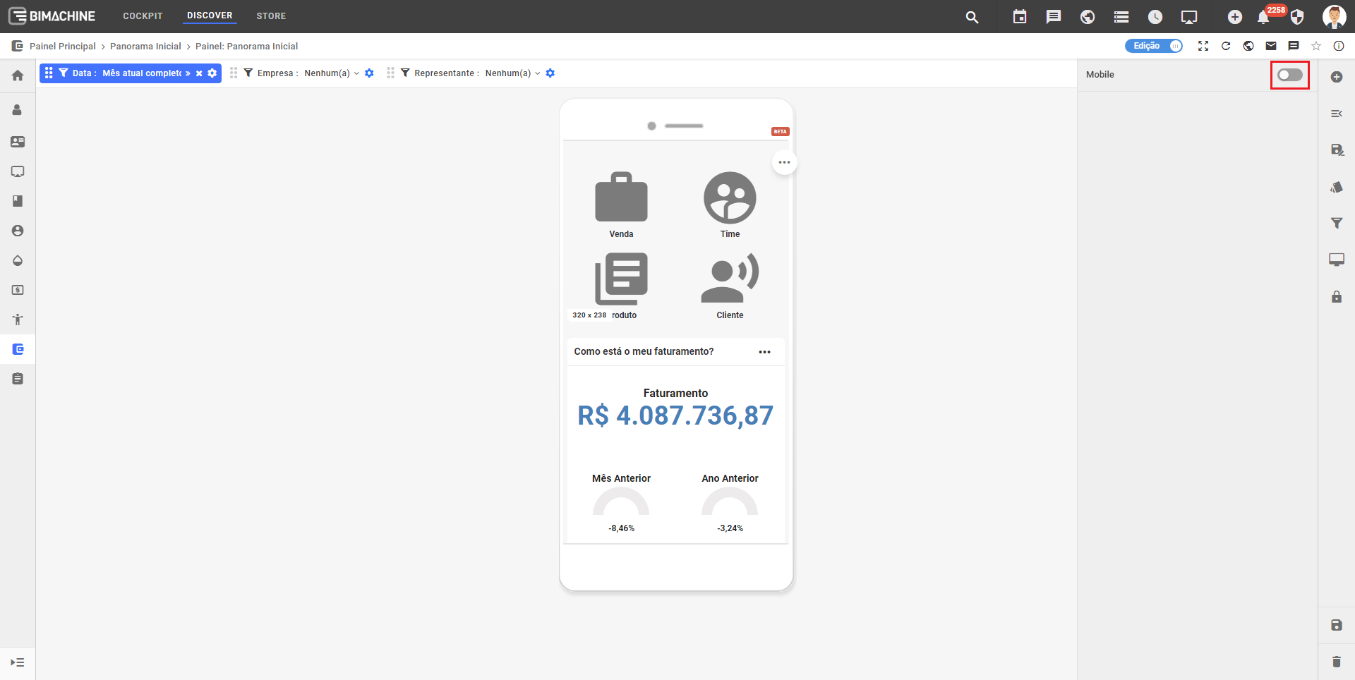
If the mobile view is disabled on the object, you can enable it by clicking on the button below
When you enable the mobile viewer, you will be shown a few options:


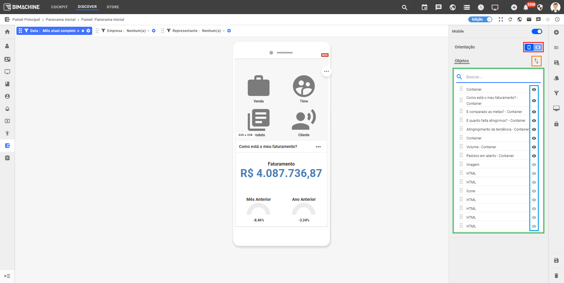
Here we have selected the horizontal orientation:
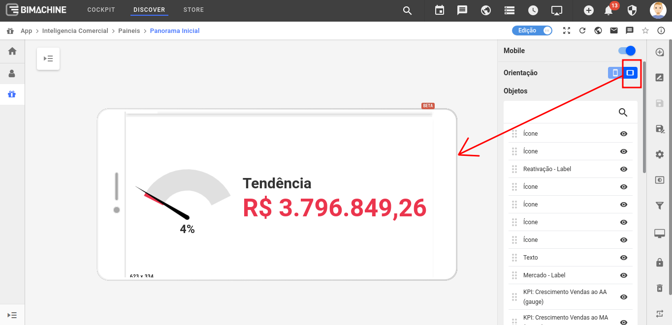
Don’t worry, if you have already set up your dashboard in vertical mode, automatic resizing occurs when you change the orientation of your mobile device to horizontal.
After setting the designer horizontally and saving the dashboard, the setting on mobile will be respected.
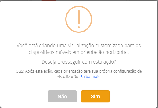
If you have not yet configured the mobile designer horizontally, you will see the following message:
Moving Object
To move objects in the mobile designer, we have two options. Move them through the side menu of objects or through the preview screen itself, just like in web dashboard editing.
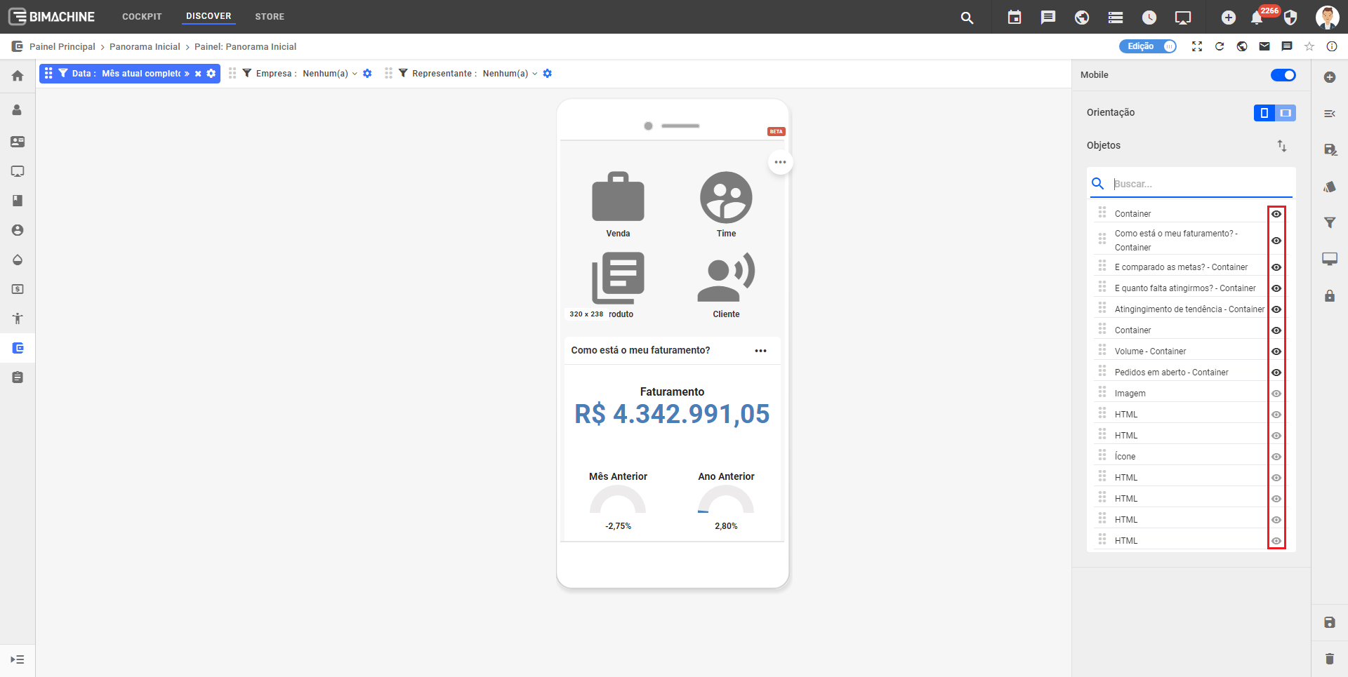
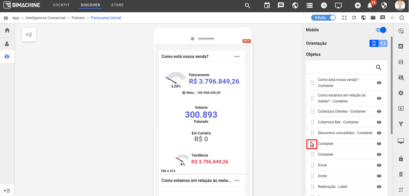
To move an object in the side menu, just click and drag the icon shown in the image below:
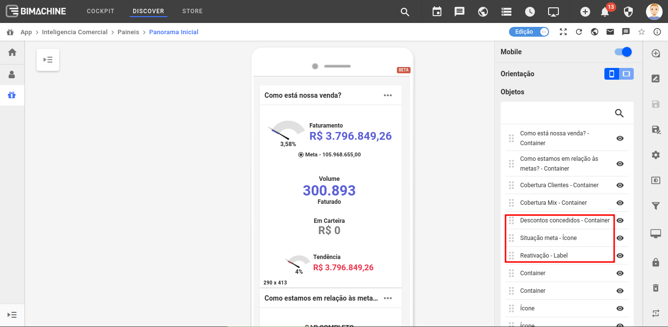
If your container has a title, you will easily identify it in the designer as we show below, because the title will be displayed in the designer listing, even if it is not displayed in the dashboard.
Hiding objects
To hide an object on mobile devices, look for the "Enable/Disable" icon.
