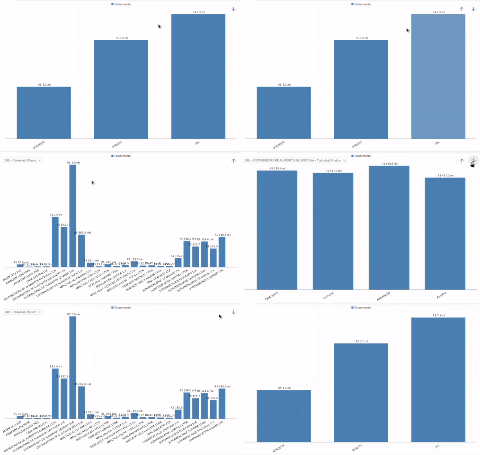
This chart template allows you to do a multi-level analysis, the information can be drill-down by interactively clicking on the chart.
Below is a step-by-step guide on how to create an interactive chart:
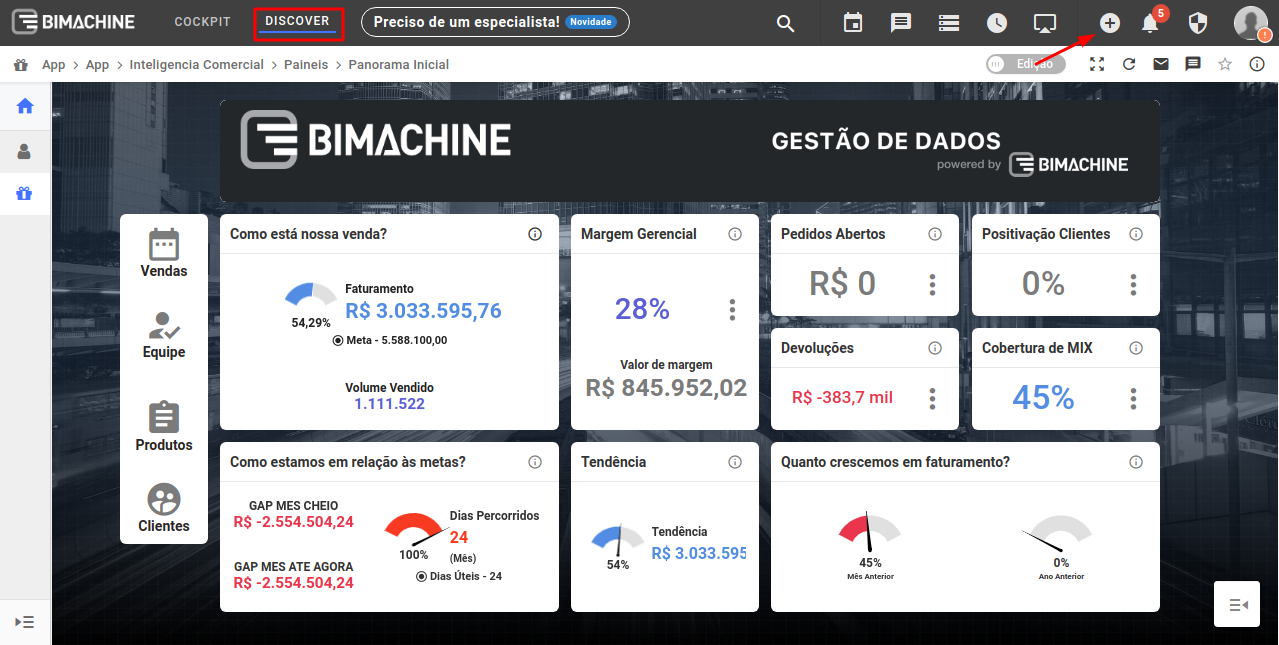
First, in Discover mode, click on the "Creation of Analytics Objects" icon.
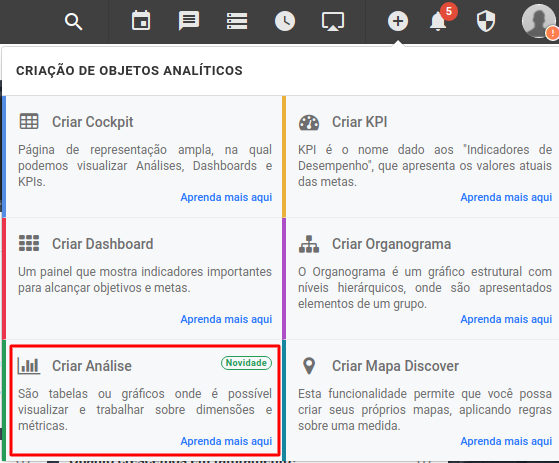
In the menu that will open, click on "Create analysis"
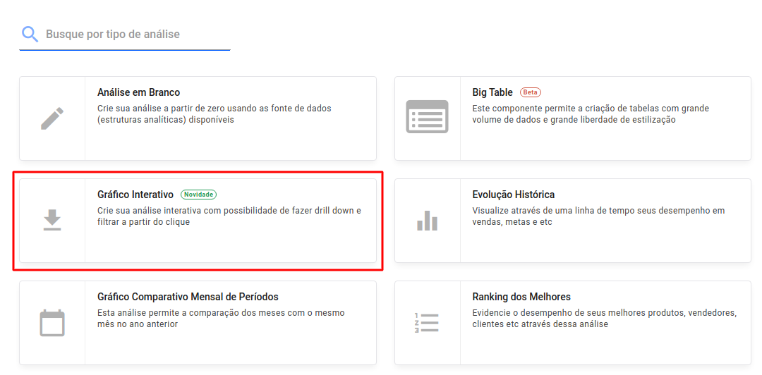
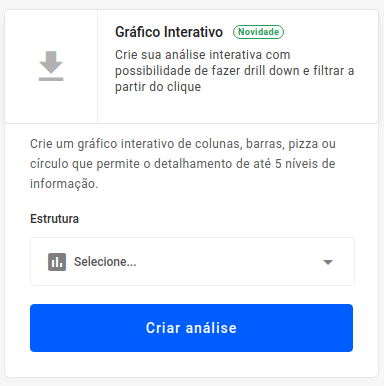
Select the option to create a Interactive Chart
Choose the structure from which you want to extract the data from to create the chart
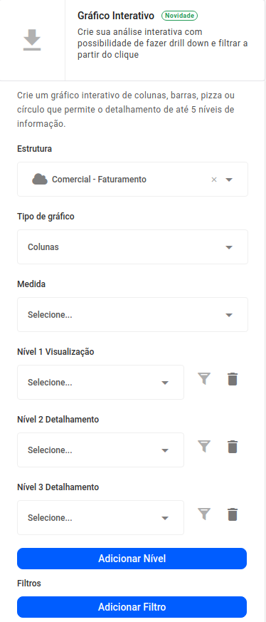
Select the type of chart you want to create (columns, bars, circle, pie), the measure, the levels of your interactive chart (you can add or delete levels according to your needs), and if you wish, apply filters.
After filling out the required fields, click the "Create Analysis" button
With your analysis created, click on the columns to advance the analysis level of your chart, or use the arrows to advance/return the levels of your chart.
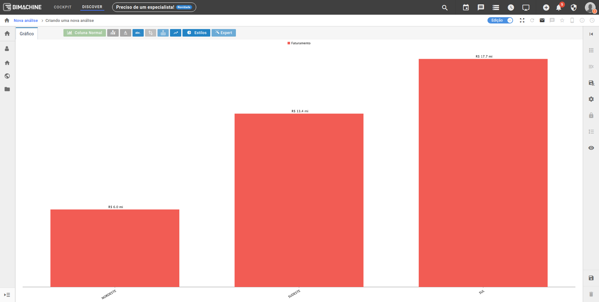
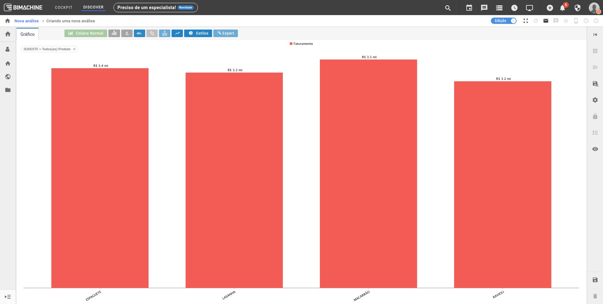
In this example, first we see the revenue value by region, by going one level forward when clicking on the column, we can see the revenue value by product in that region.
By clicking on one of the columns, the interactive chart advances one level and we can then see the following:
To drill down the graph you can also use the navigation arrows in the upper right corner:
