Pareto (also known as the 80-20 principle) states that 80% of the consequences come from 20% of the causes.
Pareto analysis alone does not serve to determine what action to take, but it is an important tool to give us an objective (quantitative) guide to action.
Basically, the Pareto is the accumulated percentage (the first data represents 32%, the second 27%; therefore the first point of the line is 32%, the second 59%, and so on).
The steps to build a diagram are:
- For pareto to make the most sense it is recommended to use only one measure and one category.
- The data (measures) need to be sorted in descending order.
- The pareto option must be enabled when creating/editing the analysis.
- The most recommended chart (for better understanding) is "Normal Column" (as shown in the examples).
Examples
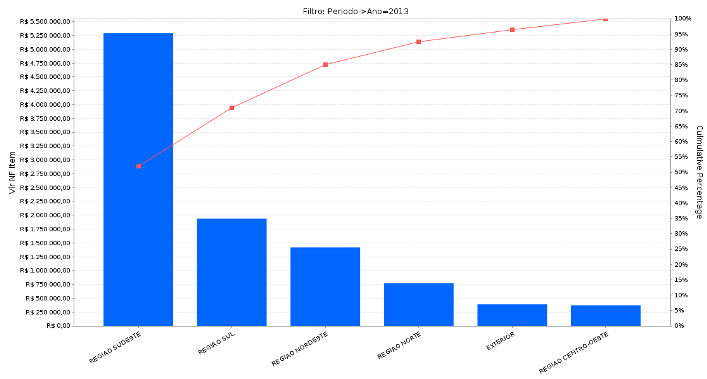
Sales by Region (Year 2013).
In this example we put the "Measures" dimension in the columns (Measure: Total sold), and put the "Region" dimension in the rows; we sort the data in descending order, enable the Pareto option, and that’s it.
Note that the Southeast, South, and Northeast regions represent 85% of sales. Therefore, these three regions represent the most significant value in the sales of the company in question.

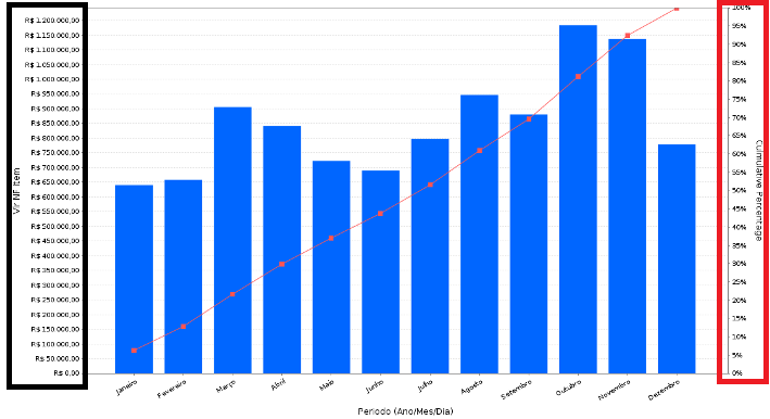
Sales by Period (Year 2013).
In this other example the category placed in the rows was "Period", but in this case we did not sort the data in descending order…otherwise the analysis would not make much sense with the months disordered, right?
Notice that the 80% was reached in October.

Note: For you not to get confused keep in mind one more detail: the percentage on the right (highlighted in red) is related to the pareto (it has no relation with the bars). The bars are only related to the values on the left (highlighted in black).

