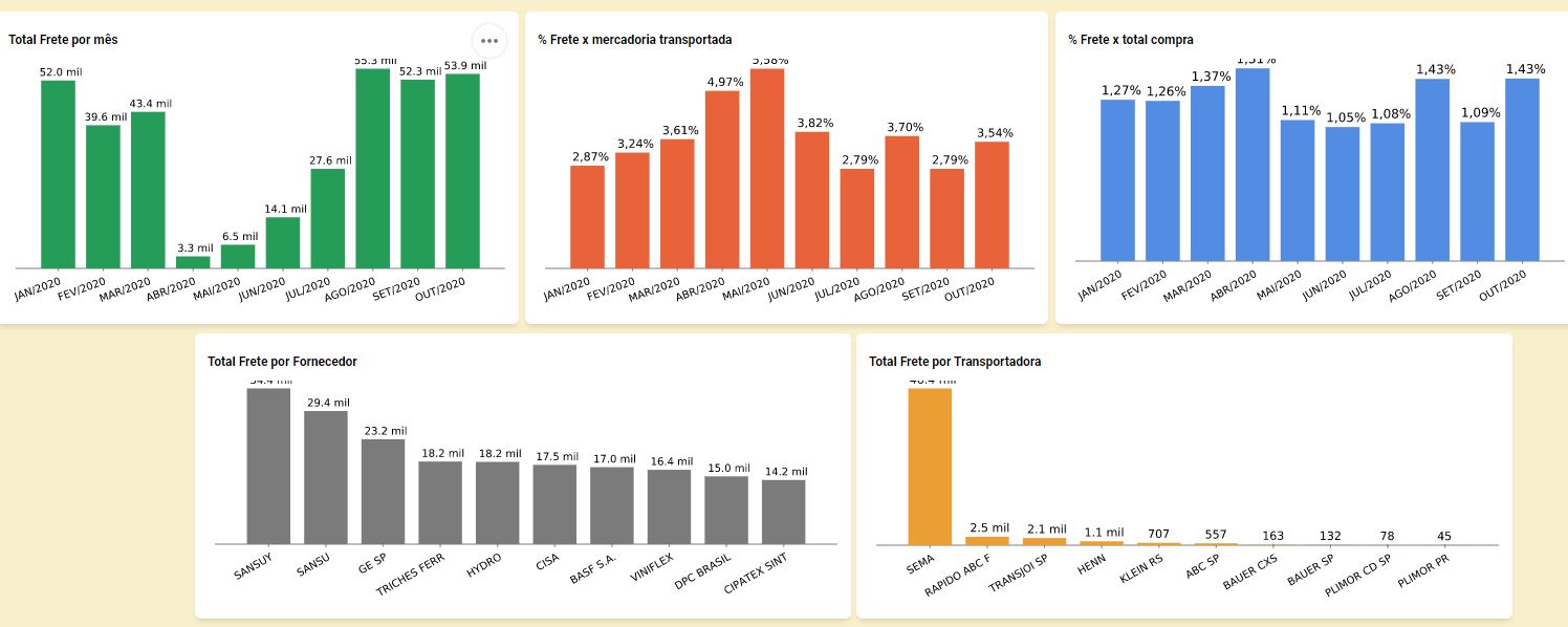
The graphical analyses are with the upper values on the edge of the area, being cut off or the visualization is difficult and I would like to increase the indentation between them.
Below is an image that demonstrates one case:

To correct what is occurring in the chart, it is necessary to change the scale, thus allowing to view the largest values and consequently making them more visible and centralized, also avoiding the cutting of the values.
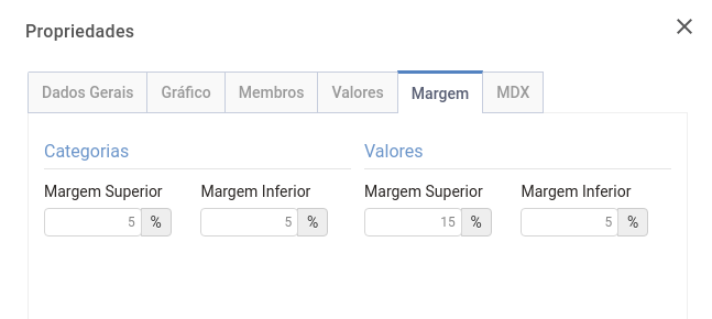
In the side Menu Settings, when configuring the analysis, displays the Properties option, in this new window that opens by accessing the Margin tab has an option to change the values of the Upper Margin and increasing this margin adjusts the visualization.
Below we have an image:


