
Types of Charts: Choose the Best Chart to Convey Your Message
You’ve got your data, you’ve made some sense of it, and now it is time to communicate your results. Great! This article will provide examples of many types of charts and graphs and explain how to pick the best one for your data depending on the message you want to convey.
Choosing a type of chart depends first and foremost on what kind of data you have and what you want to express. I find that charts and graphs are typically used to convey one of the following: comparisons/relationships, distribution, trends, composition, flow/process, or location.
1. Comparison/Relationship Charts – Pretty self explanatory, right? You have data on two or more variables and you want to show them together, probably to show a correlation or pattern of some type. Examples might include MPG of three different cars, average heights according to race, etc. Bar charts and line charts, or combinations of the two, are very commonly used for the purpose of comparison.
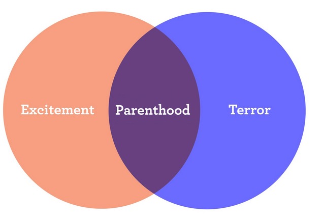
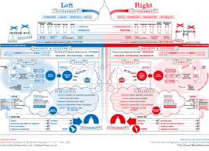
Venn diagrams are especially useful to show relationships. These are typically qualitative in nature.
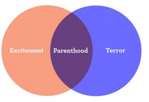
By the way, Venn diagrams can be pretty funny. Here’s a set of 12 good ones from Mental Floss, and an example of someone not understanding how they work.
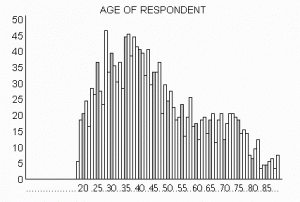
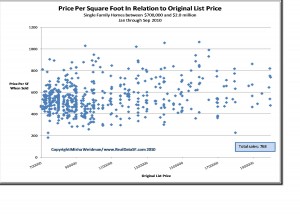
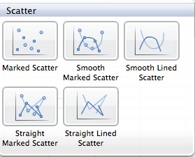
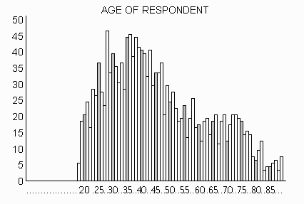
2. Distribution Charts – These types of charts aim to convey “what is the distribution?” of my data. For example, let’s say you did a survey and you asked everyone their age. A distribution chart would be useful to visualize the distribution of ages among respondents. Column and Line Histogram charts are probably the most common forms of distribution charts. Scatter plot charts are also great for this purpose.
Word clouds are an interesting way to visualize the frequency distribution of words with textual data. Here’s an example of a word cloud from the 2011 Academy Award acceptance speeches. While these aren’t the solution to the world’s problems, they can be useful from time to time in quickly analyzing open-ended comments from surveys and could be considered a type of chart.

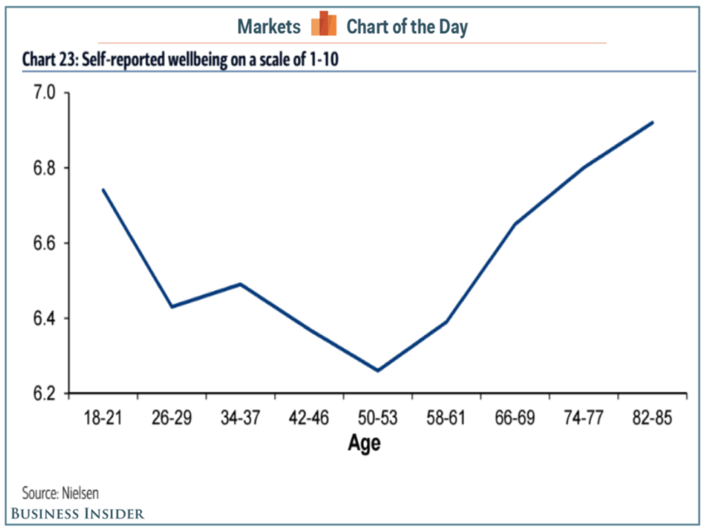
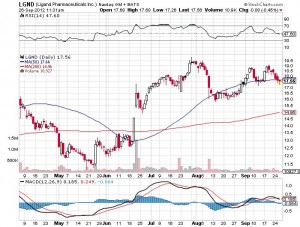
3. Charts that show Trends – While the chart categories mentioned above can certainly show trends, I think it is deserving to identify this as a category of its own. The most common way to show trends over time is with a line chart. Nowhere is this more common than in showing stock price trends over time. The chart below is a “candlestick” chart.
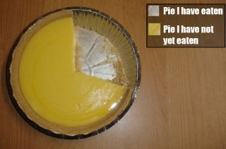
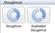
I like using doughnut charts as a variation on the all-too-common pie chart.
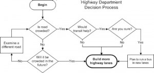
5. Flow/Process Charts – Flow charts are used to show–you guessed it–the flow of a process. These are often used to guide a decision. In fact, they are often called “decision trees.” Here’s a couple of examples:
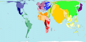
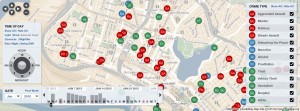
6. Location Charts (Maps) – Geographical maps and data overlays on maps are another type of chart that cannot be left off this list. Of course, everyone knows about basic maps, but take a look at some of these map-inspired charts and graphs:
Advanced Charts and Data Visualizations
Most of the charts and graphs shown above are pretty traditional. Data visualization is a hot field and there are many new cool forms of “charts” emerging. Calling them “charts” doesn’t do them justice. I’ll dedicate more time to this in another article, but here’s a sample of what I’m talking about.
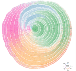
The winner of the 2018 Information is Beautiful Awards (shown below) is both art and data communication all at once. The “chart” (source) by Pedro M Cruz & team illustrates US immigration over time using the visual metaphor of tree cross section. Wow.
That’s about it. I’ve leave you with some links to additional information.
Additional Links and Information
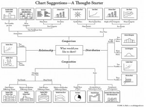
The best guide for choosing a chart that I’ve found to date is this one. They’ve narrowed down the categories of charts down to four.
“Juice Labs” has a nice tool they call the “chart chooser.” It allows you to filter based on your needs. Another option is the chooser from Chart Guide.
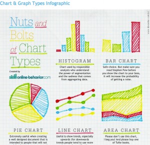
Finally, here is a nice infographic from online-behavior.com (snippet below) explaining a wide variety of chart types. I also like the handy PDF from Experception.
Fonte: https://www.mymarketresearchmethods.com/types-of-charts-choose/