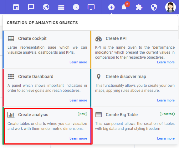
In Discover mode, click on the "Create Analytic Objects" icon and then on "Create Analysis".

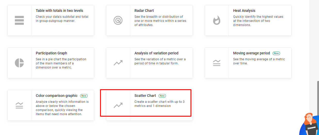
Choose "Scatter Chart"

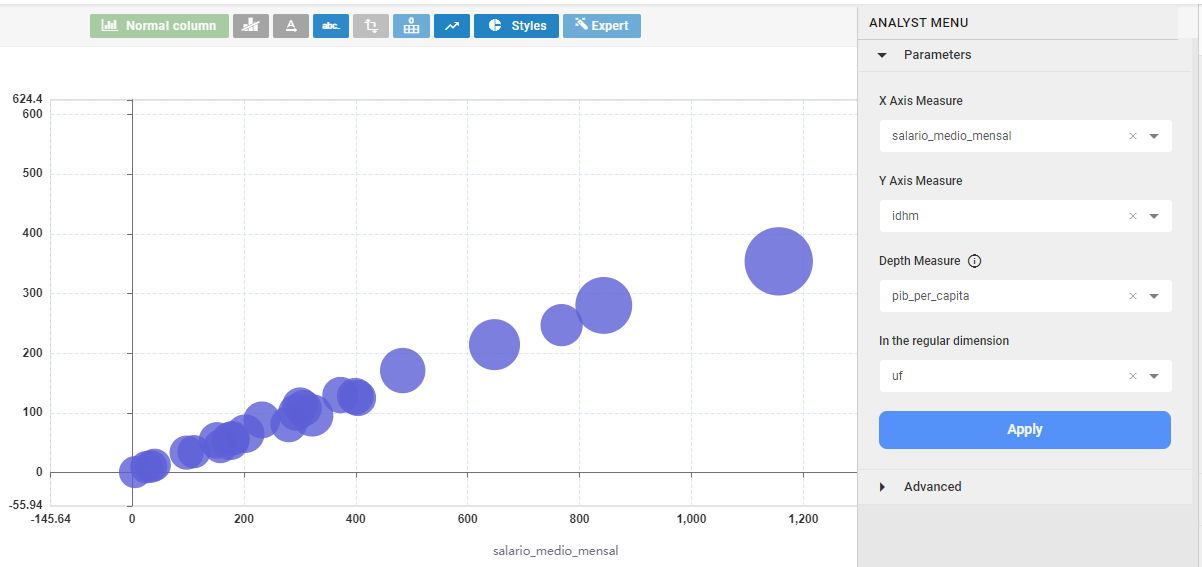
After that, select the data structure and the fields to create the chart. Once everything is filled out, click "Apply" and save.

If the graph has a positive correlation, it looks similar to the example above. The correlation can also be negative and neutral. Learn more about correlations by clicking here.

