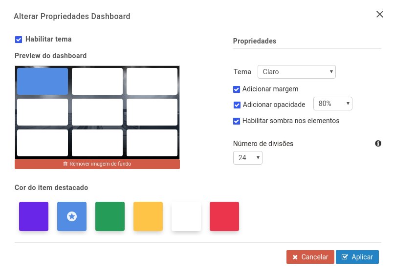
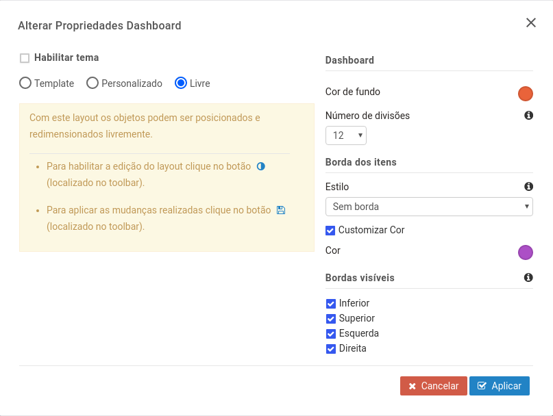
* a number of divisions for your dashboard (the more divisions on your dashboard, the more freedom you have to assemble elements and; if you have fewer divisions you have less flexibility to move elements);
* a style and color for the border of dashboard elements and the position in which they will be visible (top, bottom, left and right);
Note: The palette colors are the same as the ones you set for your project, but you can also customize them.
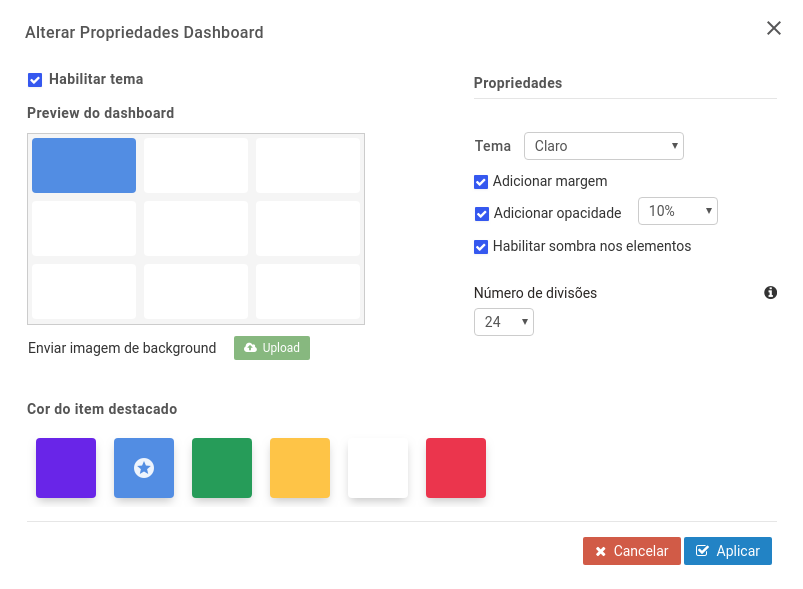
You can also enable a theme by clicking on the checkbox below:
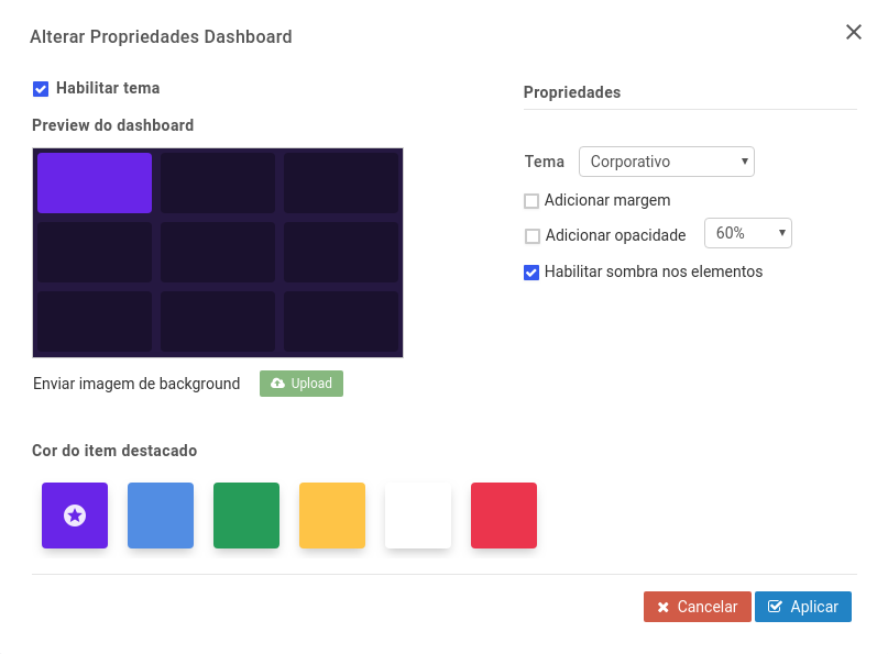
Note: The margin is a spacing between the elements and around the page. Opacity is the degree of transparency of the object and can vary from 10 to 100%; It interferes with the look of the container and the background of the objects.
This way:
– If you choose the light theme, it will come with 100% margin and opacity and shadow enabled by default;
– If you choose the dark theme, it will come with 40% margin and opacity and shadow enabled by default;
– If you choose the corporate theme, it will come with 30% margin and opacity and shadow disabled by default.
Note: this shadow is projected behind the elements.
Tip: We recommend that when you create a new dashboard you draw the objects pasted together so that when you add margin, the objects are automatically aligned. This way you don’t have to worry about dragging objects and manually aligning them, as the system will do it for you.
We emphasize that the smaller the number of divisions, the easier it will be to align objects and the better the performance. Therefore the default when creating a new dash is 24 divisions. We recommend using the default or less:12 divisions.
Use 96 divisions if you have not added margin to objects or if you want to have many objects side by side in the dashboard.
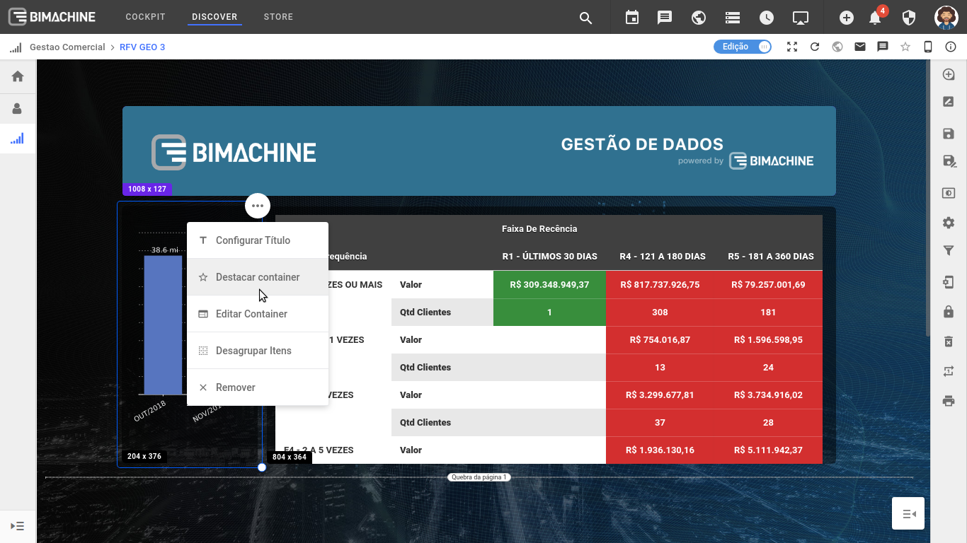
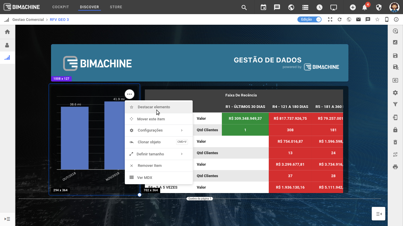
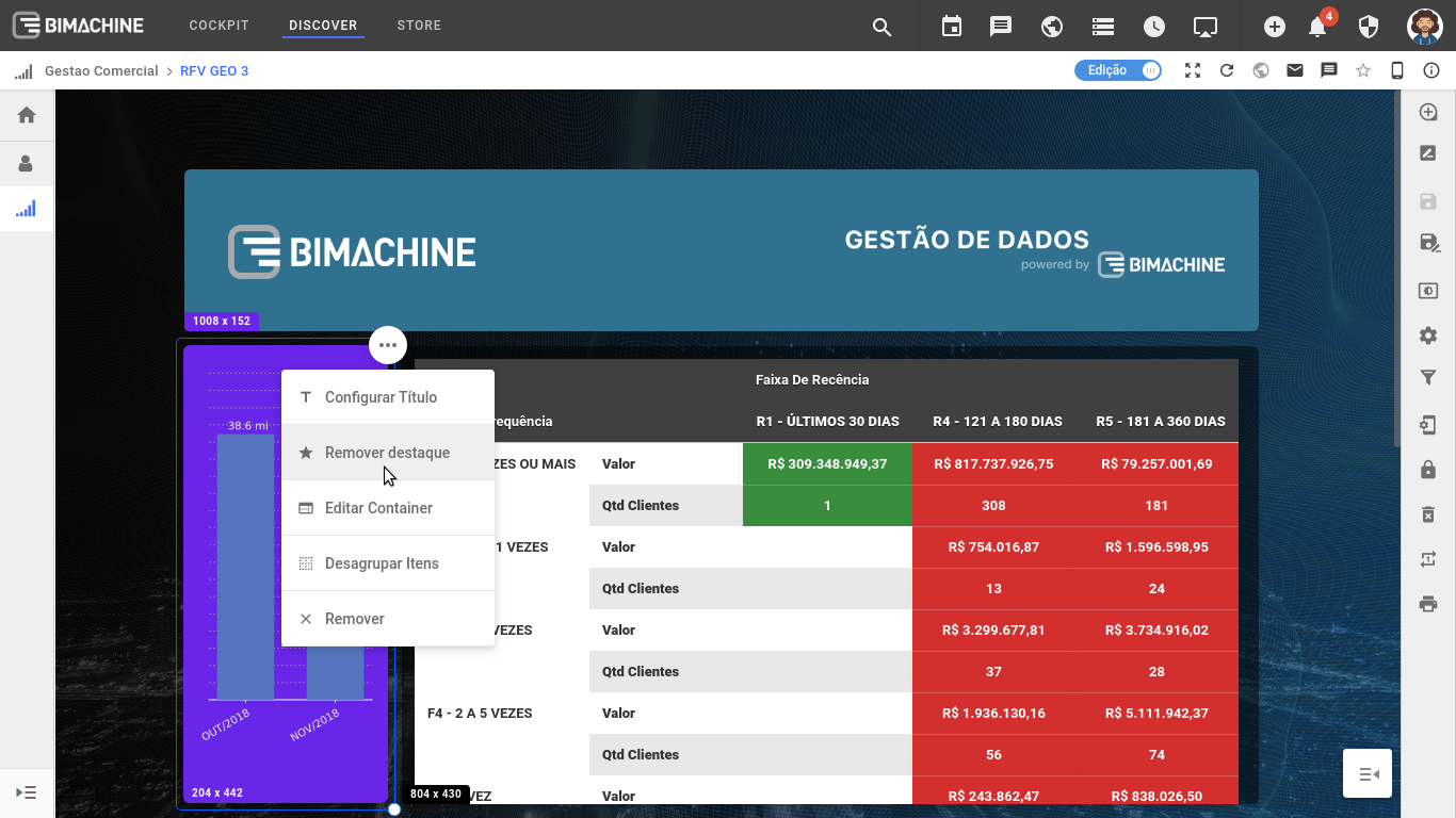
Still on the "Change Dashboard Properties" screen, in the "Highlighted Item Color" section, you can select one of the available colors to highlight one or more of your dashboard elements, as shown below. You need to select the color of the item to be highlighted and click "Apply".
