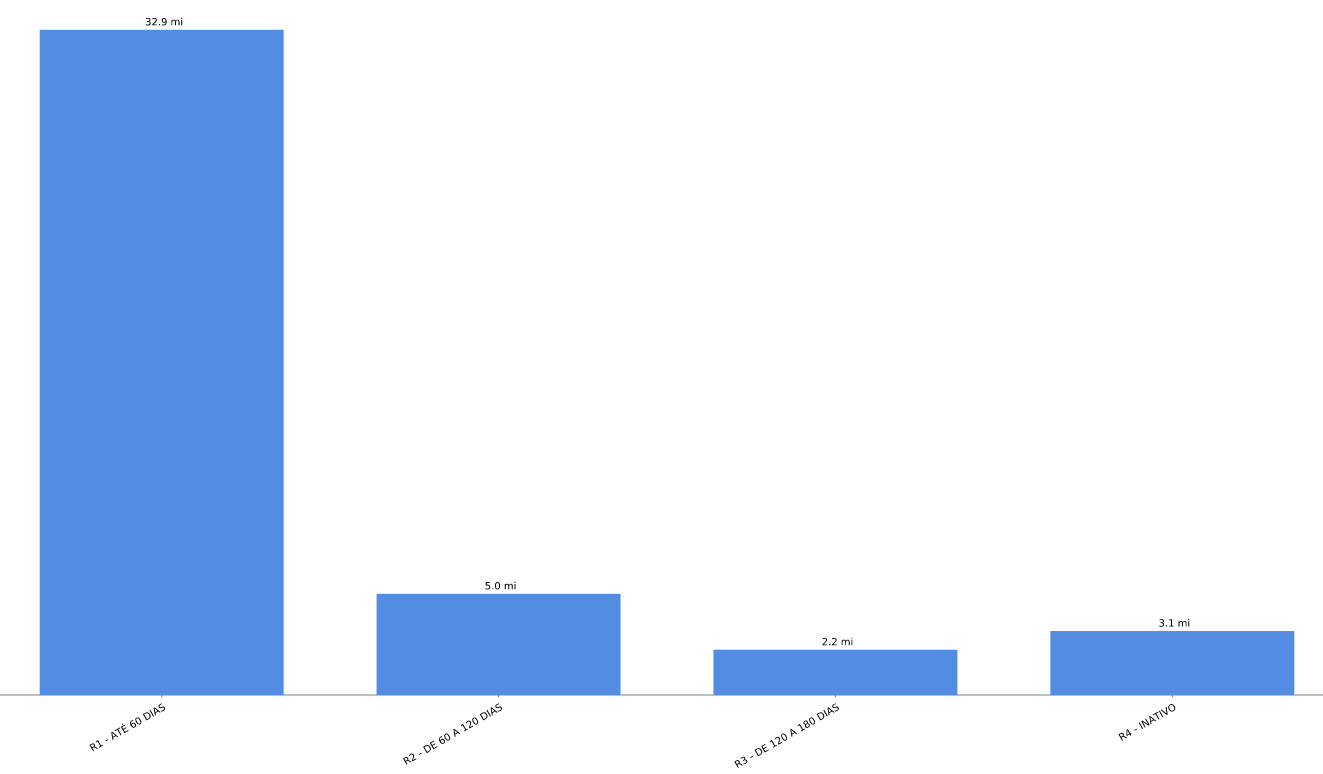
Visualize information categories in a bar chart. This analysis allows the comparison between members of a business. You could compare, for instance, how much each of the salespeople have sold in the period.
Business application example:
Comparison of REVENUE by CLIENT TYPE in the CURRENT YEAR based on the dimension DATE OF THE INVOICE.
Parameters:
<Measures>: Name of the metric to be used
<Dimension>: Name of the dimension that will be used to segment data
<DateDinamicFilter>: Periods of time selected for the analysis
Resulting chart:


