
According to the data you need to expose here, we will help you choose the best chart, so that your analysis is well represented.
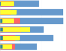
Columns
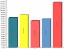
The best known and most used type of chart, which can be used for most analyses.
Normal: Crosses the data from one column to another, and can be used in a multi-column analysis. (Ex: Total sales, where the columns are the months or years).

Normal 3D: Similar to the "normal" mode with a 3rd dimension effect.
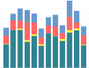
Stacked: Similar data gets stacked, leaving the category total in evidence. (Ex: Total Sales, the columns are the months, and each piece of information [color] are the branches of your company).
3D Stacked: Similar to the "stacked" mode with a 3rd dimension effect.
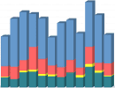
Layers: This follows the same idea as the "Stacked" type, but in "Layers" the columns are one in front of the other (from largest to smallest).
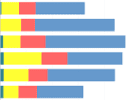
Bars
Following the same idea as columns, but the use of bars becomes more advisable when the labels are too long or because they are better understood horizontally.
Normal: Crosses the data from one column to another, and can be used in a multi-column analysis.
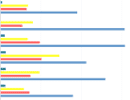
Normal 3D: Similar to the "normal" mode with a 3rd dimension effect.
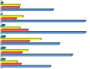
Stacked: Similar data is stacked, leaving the category total highlighted.
3D Stacked: Similar to the "stacked" mode with a 3rd dimension effect.
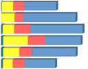
Layers: This follows the same idea as the "Stacked" type, but in "Layers" the columns are one in front of the other (from largest to smallest).
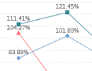
Lines
Line graphs are best used to expose trends over time (whether in days, months, or years).
Vertical: Displays the categories horizontally, showing the data vertically.
Vertical 3D: Normal with 3D effect.
Horizontal: Displays the categories vertically, while showing the data horizontally.
Horizontal 3D: normal with 3D effect.

Curved (New!): Normal with line smoothing.

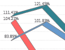
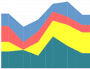
Area
Following the same trend as "line" graphs, "area" graphs highlight the differences between data sets over time.
Vertical: Displays the categories horizontally, showing the data vertically.

Vertical Stacked: Similar data is stacked, leaving in evidence the total of the category in question.
Horizontal: Displays the categories vertically, while showing the data horizontally.
Horizontal Stacked: Similar data is stacked, leaving the category total in evidence.

Pizza
With two or more categories that have a corresponding value, we can use the pie chart.
Ex: Share of subsidiaries in the company’s total profit, percentage of age groups at an event, etc.
By Column: Graph built based on the data in the columns.
By Line: Graph built based on the data in the lines.

By Row 3D: normal with 3D effect.
By Column 3D: normal with 3D effect.

Circle
Very similar to the "Pizza" chart, the Circle shows the related value categories more clearly.
By Column: Graph built based on the data in the columns.
By Line: Graph built based on the data in the lines.

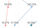
Radar
Shows the values related to a central point. The points referring to the same value are connected by lines (resembles the "Lines" chart, only in circular form).
By Column: Graph built based on the data in the columns.
By Line: Graph built based on the data in the lines.

By placing the mouse over the colors, the chart shows the column/fraction/race/etc. information.