The scatter chart is used to find out if there is a correlation between two variables. That is, to assess whether the variation in the value of a Y variable is correlated to the variation in an X variable. The graph has two axes, the X-axis and the Y-axis. Usually the relationship between them comes from a dependent and an independent variable, where the dependent depends on the independent variable. Let’s look at an example to make it easier to understand:
As an example, let’s use the scenario of an ice cream parlor. If we say that temperature interferes with ice cream sales, we are making a positive correlation, because the facts are true. On the other hand, if we say that the color of the customers’ shirts interferes with sales, the correlation will be negative or neutral, since these two variables are not directly correlated
Correlations between the variables
Correlation of variables is the relationship between variables. Let’s look at the 3 types of correlations:
- Positive Correlation: When a concentration of the points in an increasing trend occurs.
- Negative Correlation: When there is a concentration of points in a decreasing trend.
- Neutral Correlation: When there is no concentration of points in an increasing or decreasing trend.

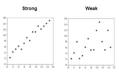
We can also analyze whether the correlations are strong or weak.
- Strong: When the points are less disperse.
- Weak: When the points are more disperse.

That is, the stronger the correlation, the more it means that these points are moving in the same direction, whether positive or negative.

