In this version we have the following changes:
New Assisted Analysis: Interactive Graphics
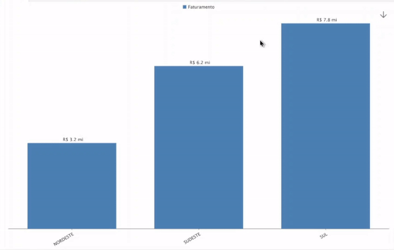
A new way to visualize your data. With Interactive Charts, you can drill down on the analysis and apply filters by clicking on the Column (for column chart) or Slice (for pie chart).
Note:
The interactive graphic is currently in beta testing and will gradually be available to all of our users.
Improved Users and Groups screen

Now it is easier and more intuitive to handle and create your cockpits, we have redesigned and reorganized the buttons and menu options for better user experience.
Color Palette: Shades
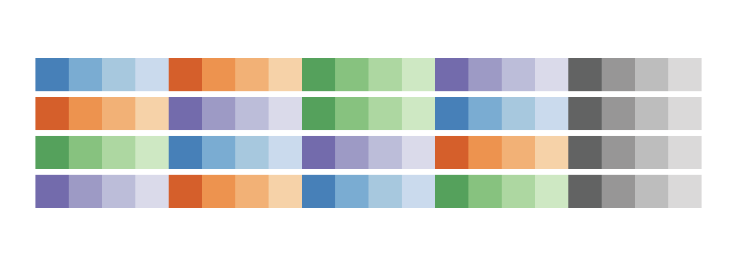
Style and customize your analytical insights with the new Shades color palette. There are 4 new color templates to use.
|
Número
|
Feature
|
Versão
|
|---|---|---|
|
#4242
|
Interactive Charts
|
2.60.0
|
|
#4966
|
Improved Users and Groups screen
|
2.60.0
|
|
#5744
|
Shades Color Palette
|
2.60.0
|
|
#5759
|
New parameters and improvements in the Ploomes connector
|
2.60.0
|
|
#5576
|
Possibility to remove icon and title in a container
|
2.60.0
|
|
#5432
|
Possibility to deactivate a map caption
|
2.60.0
|
|
#5539
|
Show which fields have the same name in the Json Connector
|
2.60.0
|